Items
-
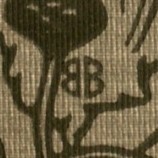
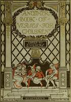
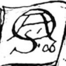
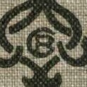
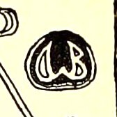 Alice Bolingbroke Woodward Alice didn't often sign her cover designs, but in her illustrations she used a monogram of a central W flanked by an 'A' and a 'B'. She also had a habit of incorporating her monogram into part of the illustration, making it difficult to spot at first glance.
 -
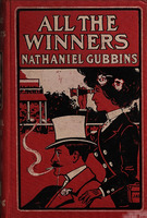 All the Winners JAD
 -
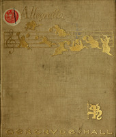 Allegretto Cat monogram
 -
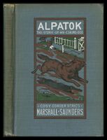 Alpatok Cloverleaf
 -
 Amber glints seahorse
 -
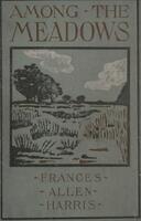 Among the meadows : a novel G (sans serif with long bar)
 -
 Among the palms EWC
 -
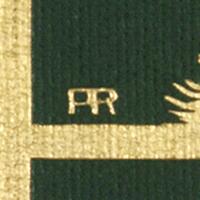 Amy Carol Rand Amy's monogram could take on a few different styles.
 -
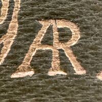 Amy Richards Amy Richards signed her books with an AR monogram. The leg of the A is slanted, unlike the similar monogram used by Amy Rand, which is more squared off.
 -
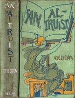 An Altruist HBM
 -
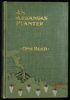 An Arkansas Planter seahorse
 -
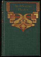 An Arkansas Planter seahorse
 -
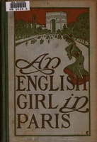 An English girl in Paris M inside C
 -
 An English Village W with serifs
 -
 An Englishwoman's love-letters "Limp" vellum with yapp edges and green silk ties and gold stamping on spine. Was actually written by Laurence Housman. Binding also designed by Housman.
 -
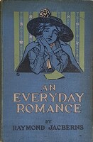 An Everyday Romance NA in box
 -
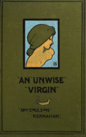 An Unwise Virgin A inside of G
 -
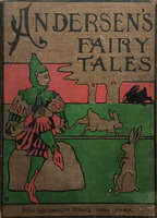
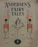 Andersens Fairy Tales Retold in One-Syllable Worlds SH intersecting
 -
 Andy Barr H with E inside
 -
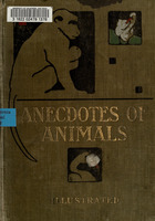 Anecdotes of animals CHD?
 -
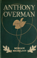 Anthony Overman Unsigned
 -
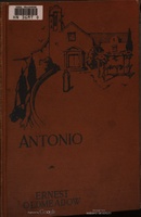 Antonio DD
 -
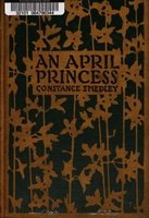
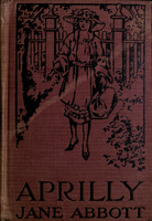 Aprilly DD
 -
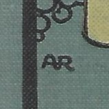 AR A monogram used by an American designer who did several covers for the American Book Company, but also a few for some other American publishers. The monogram they used was different than that used by Amy Rand or Amy Richards. The letters are often separated, and have a round quality to them, with no serifs.
 -
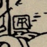
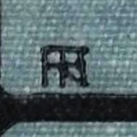 AR (blocky, with line through it) This does not seem the be the monogram used by either Amy Rand or Amy Richards. The designer who used this monogram did covers for Boston publishers Dana Estes, Little Brown, and L.C. Page and Company.
 -
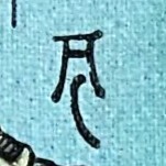 Archibald Chasemore A cartoonist known primarily for the cartoons he did for Judy (1875-1889) and Punch (1868-1879).
 -
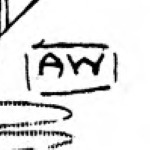 Archibald Webb Not to be confused with Archibald Bertram Webb (1887-1944) who signed his work A.B. Webb.
 -
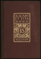 Ars et vita, and other stories AR conjoined
 -
 Arthur Rackham Arthur Rackham was an English book illustrator. He is recognised as one of the leading figures during the Golden Age of British book illustration.
 -
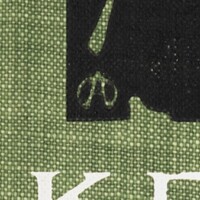 Arthur Sinclair Covey A in circle
 -
 Arthur W. Rushmore Arthur W. Rushmore was a book designer who also was the director of design and manufacture at Harper and Brothers for many years. He signed his cover designs and other illustrations with either a small "R" or "AWR" monogram.
 -
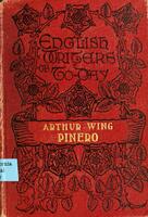 Arthur Wing Pinero, playwright Fancy AH? FCA?
 -
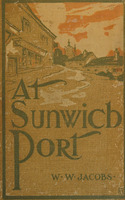
 At Sunwich port CMW
 -
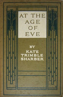 At the Age of Eve C with crown
 -
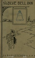 At the Blue Bell inn seahorse
 -
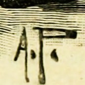
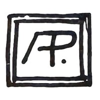
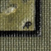 August Petrtyl August Petrtyl signed his designs with either an AP or P monogram.
 -
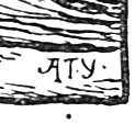 Austin Young Young was not very prolific - only one cover design of his has been identified, and he also only illustrated a couple of books. Very little is known about him. He is presumed to be British due to his work only appearing in books by London publishers.
 -
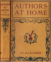 Authors at Home HEF
 -
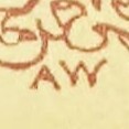
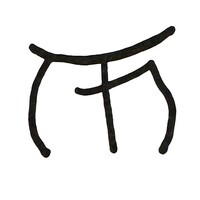
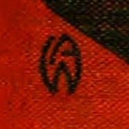 AW (Conjoined) A yet to be identified designer who used a monogram that resembles a rounded arrowhead, similar in shape to the Star Trek communicator badge. The actual letters used are an A and W, which are conjoined into one shape.
 -
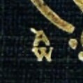 AW (stacked) This designer seemed to do some covers for John Long.
 -
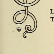 Aymer Vallance Aymer Vallance's monogram was identified from the initials designed by him for the work he authored on William Morris, "The Art of William Morris" published by George Bell and Sons in 1897.









































501–750 of 6940